Dairy
Drop
An end-to-end UX/UI case study for a subscription-based dairy & non-dairy delivery app — designed to feel as effortless as “set it and forget it,” from first search to one-tap subscription control.
 UX/UI Case Study
“Set it and forget it” dairy delivery
DairyDrop is a subscription-based dairy and non-dairy delivery service that gives customers the convenience of a grocery run — without the trip. The goal was a validated, low-friction flow built around three things: search, transparency, and effortless subscription control.
The approach combined competitive research, primary user interviews, and quantitative market data to move from assumptions about the target user to a design grounded in real behaviour.
How might we make dairy delivery reliable and flexible?
Help customers achieve reliable, flexible dairy delivery without dealing with unpredictable delivery windows and confusing subscription management?
Sole designer, end-to-end
End-to-end ownership of research, strategy, interaction design and visual design. The design goal was invisibility — every decision measured against one question: does this remove a step, or add one?
My responsibilities
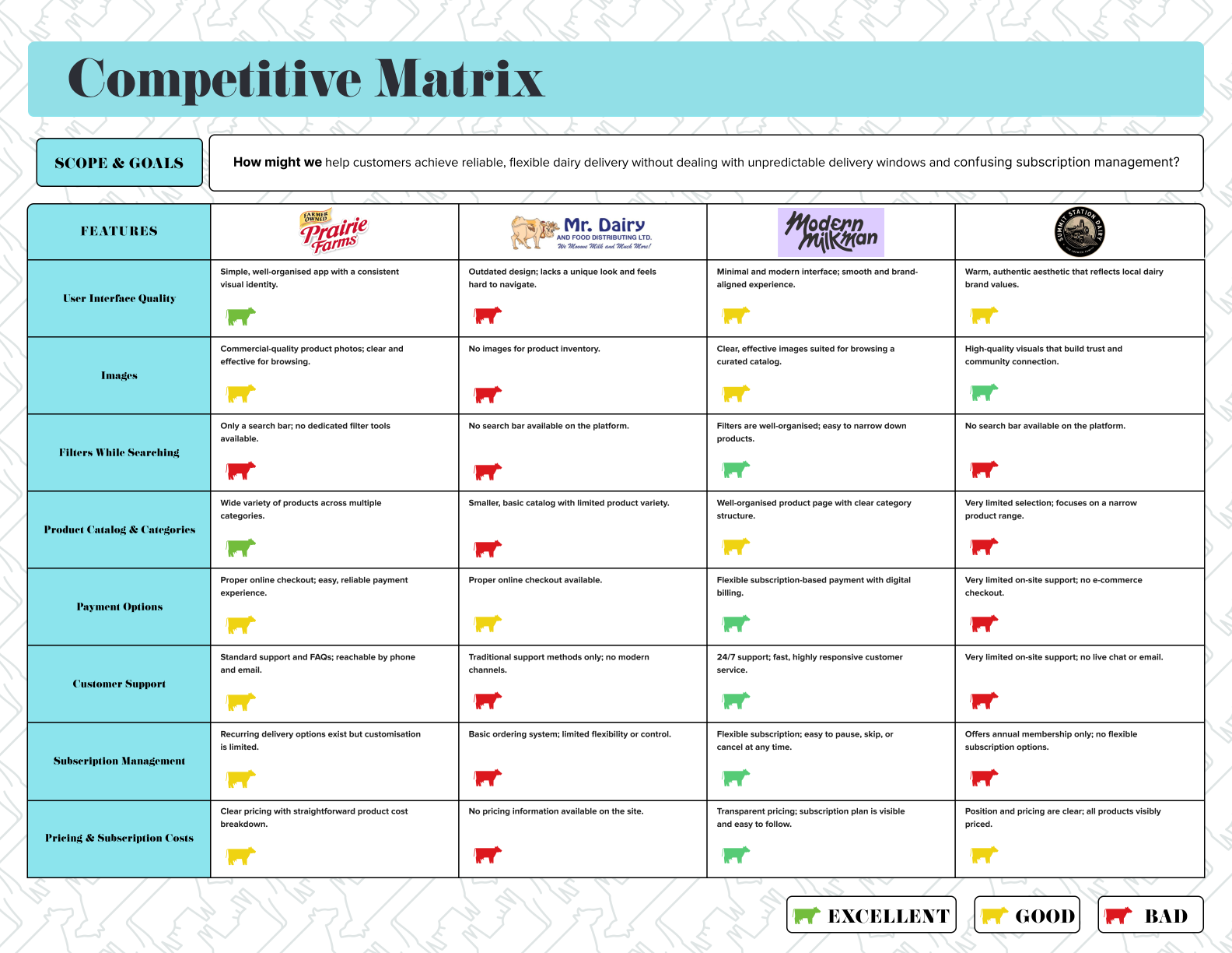
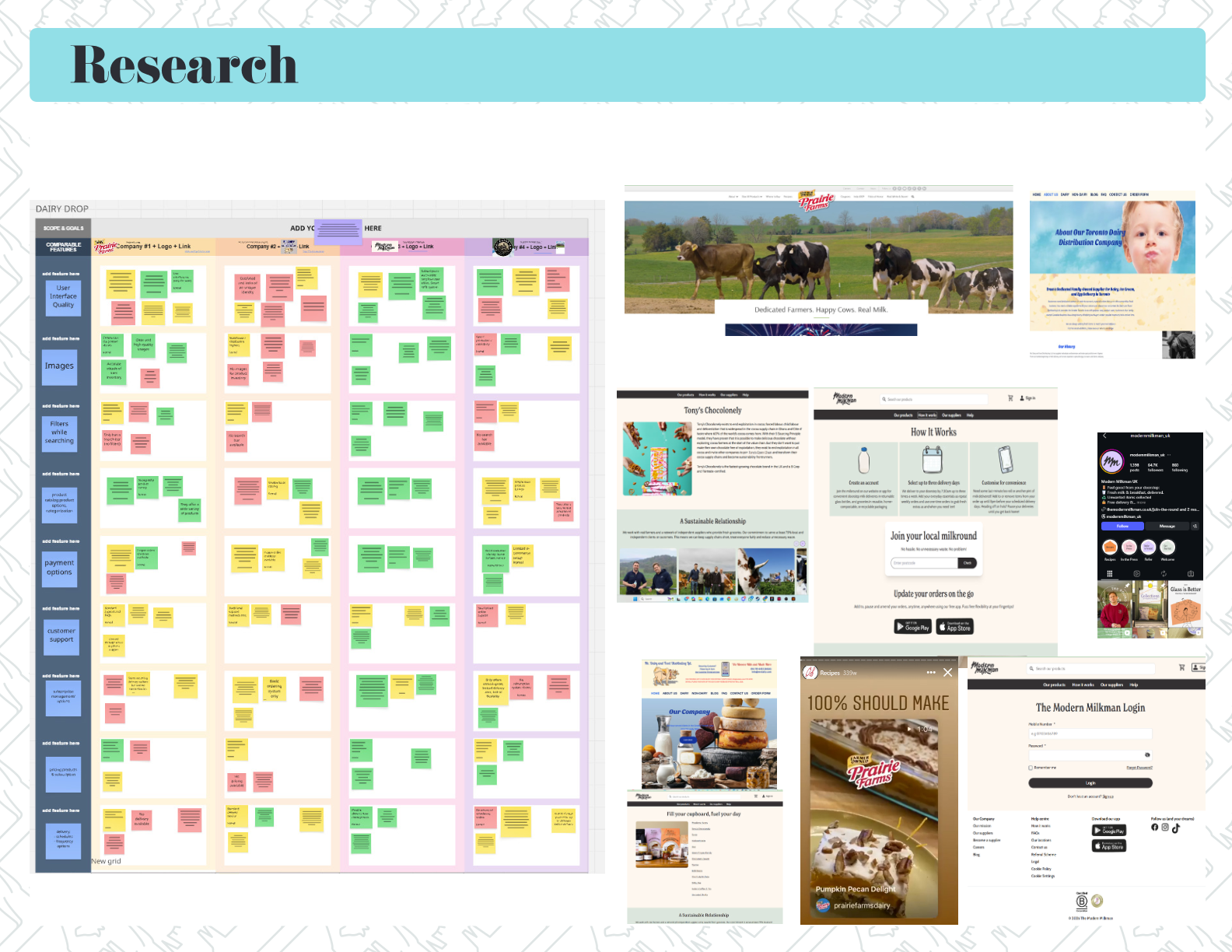
- Competitive analysis of four direct competitors across ten feature dimensions
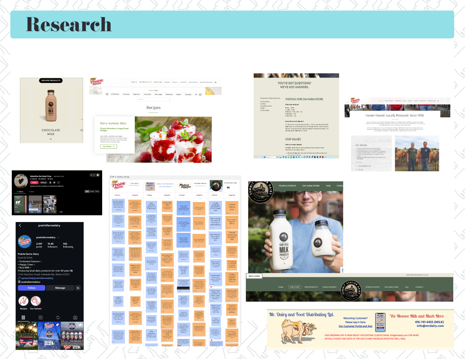
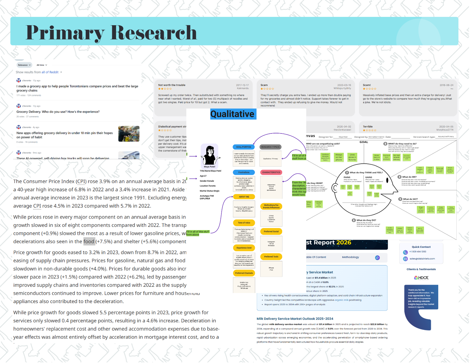
- Primary qualitative research: walk-and-talk interview with the target user
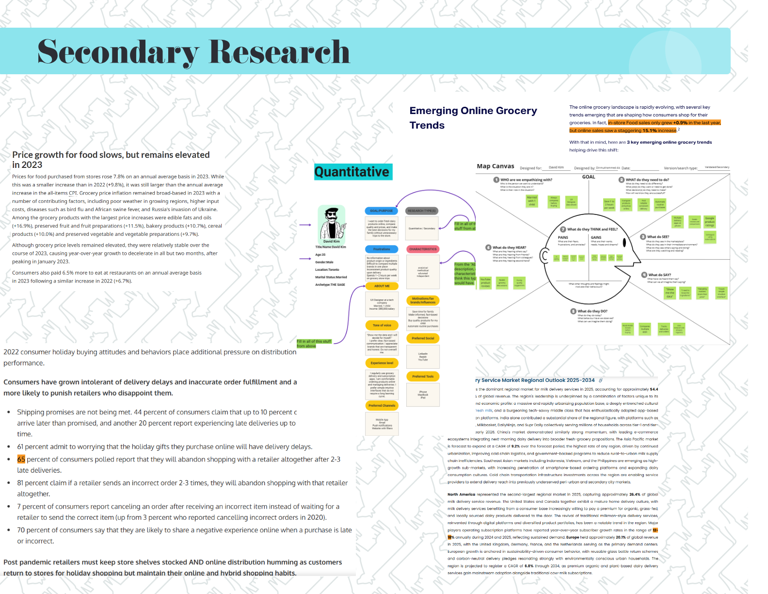
- Secondary quantitative research: market sizing, delivery-abandonment data, food price indices
- Assumptive and validated personas, empathy maps and user flows
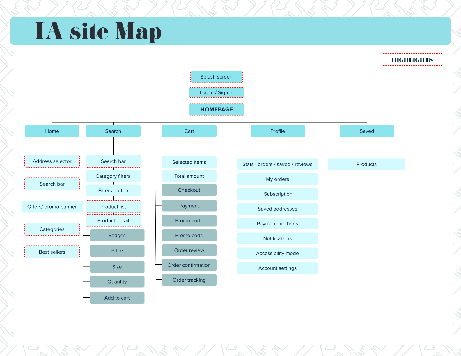
- Information architecture and sitemap
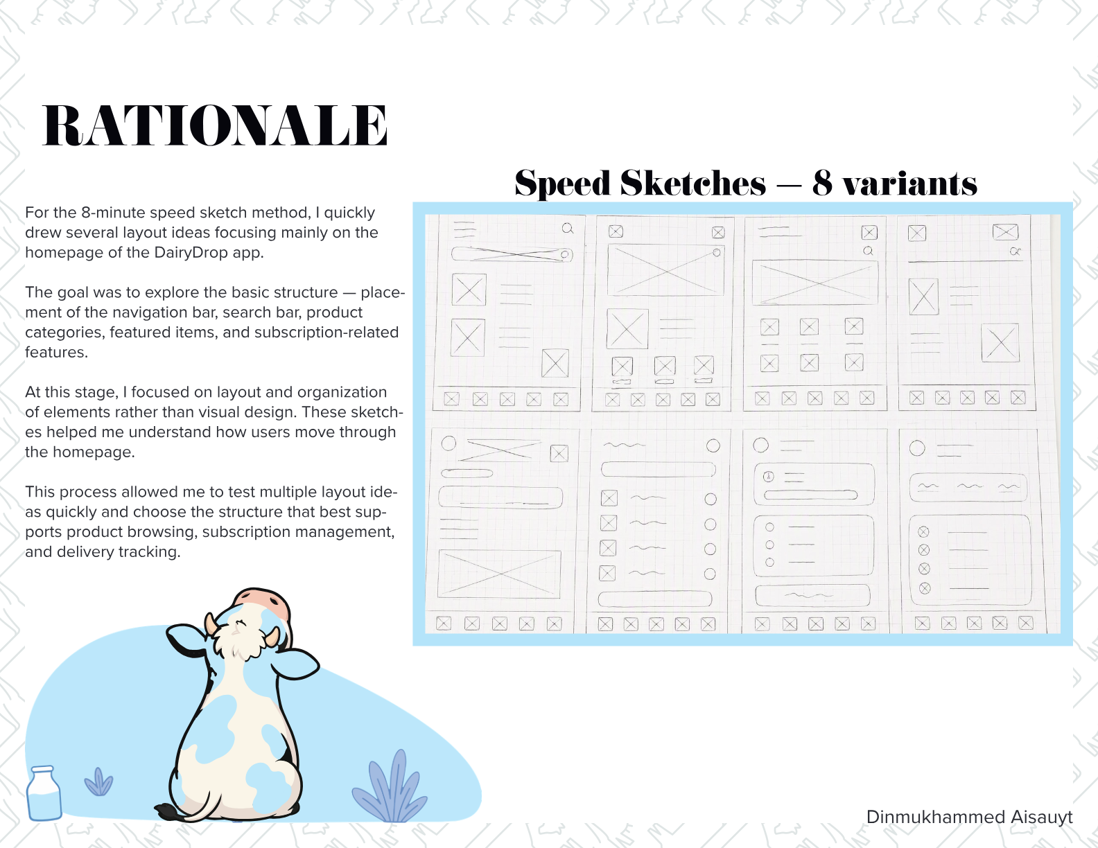
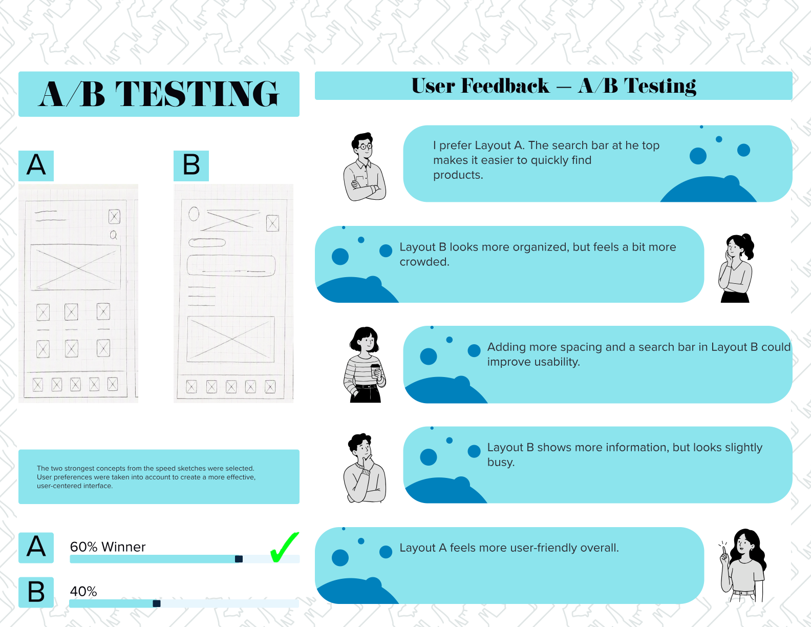
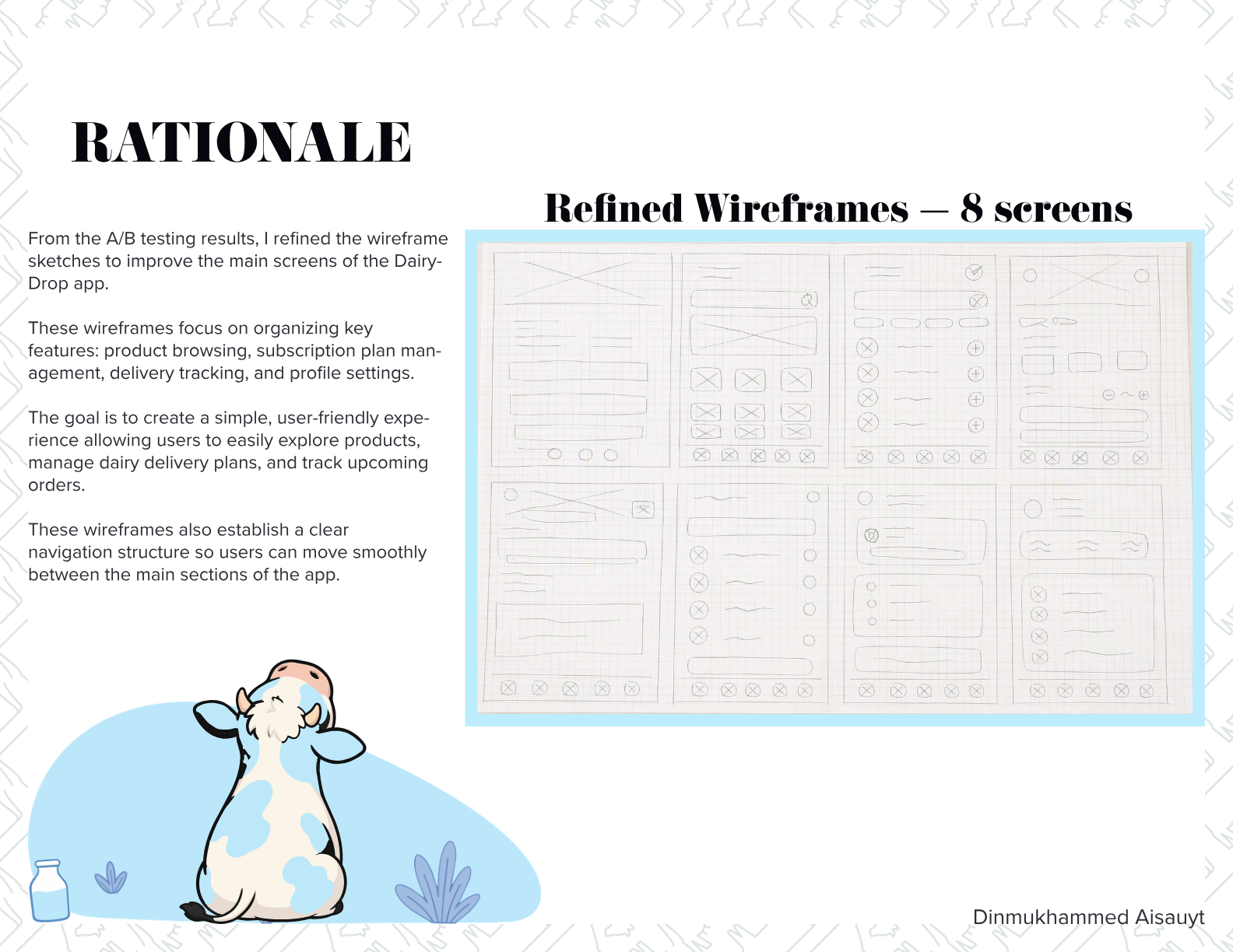
- Speed sketching, A/B testing, low-, mid- and high-fidelity wireframes
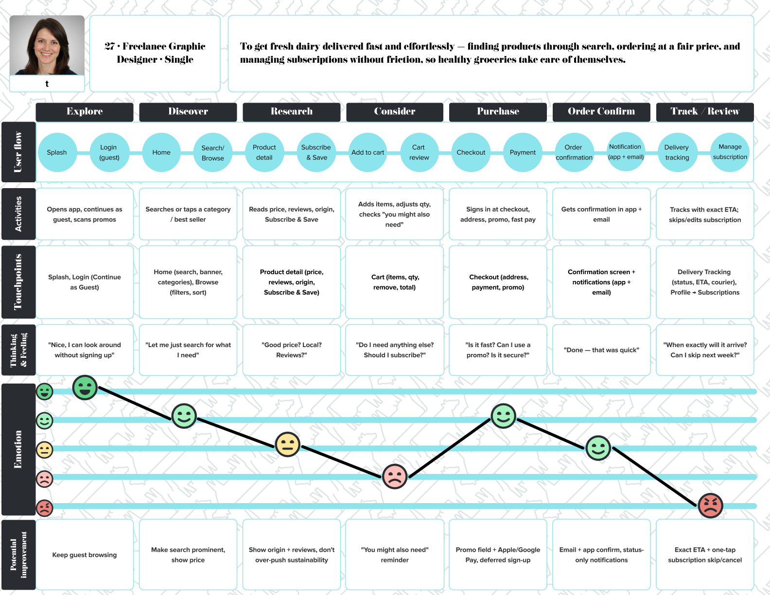
- Customer journey map
- Interactive prototype and brand-aligned UI system
Project vision
To build a dairy delivery app that feels as considered as the product it delivers — where a customer can find what they need in one search, understand exactly where their milk came from, know precisely when it will arrive, and skip a week in a single tap.
Success criteria
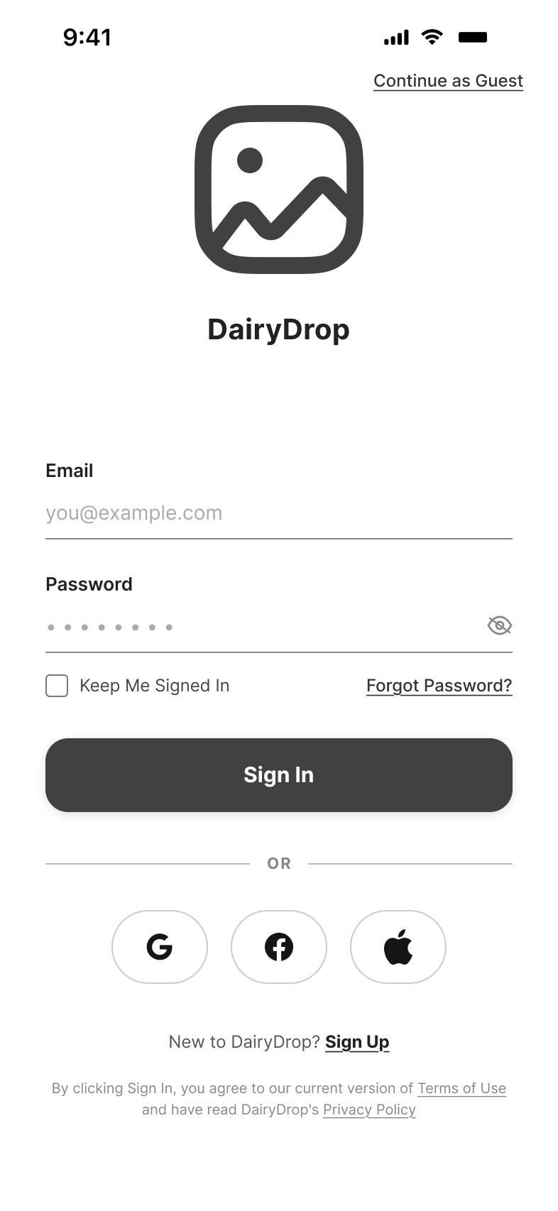
- A first-time user reaches a product page without creating an account
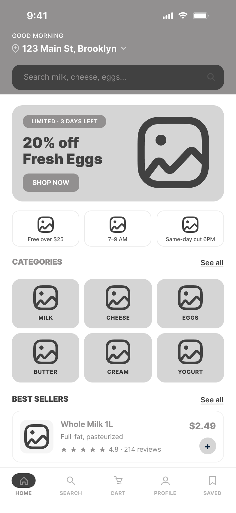
- Any product is findable in one search
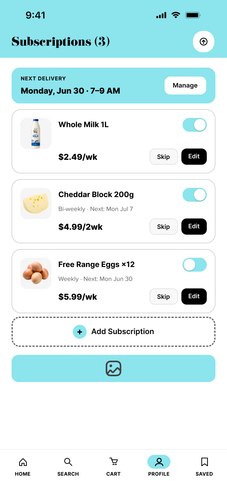
- Subscription pause or skip in a single tap
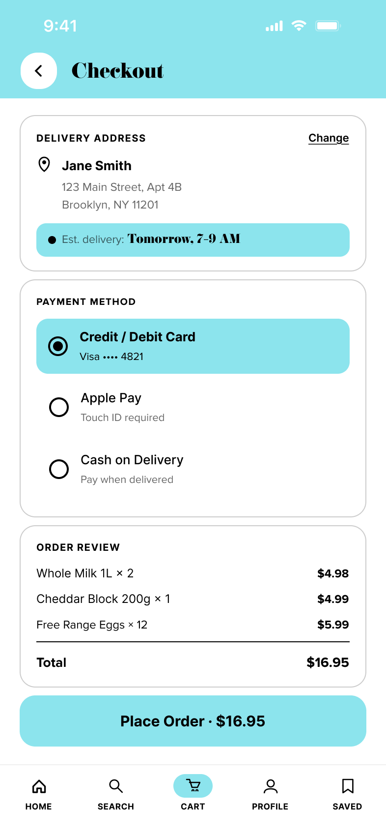
- Delivery ETA visible before checkout
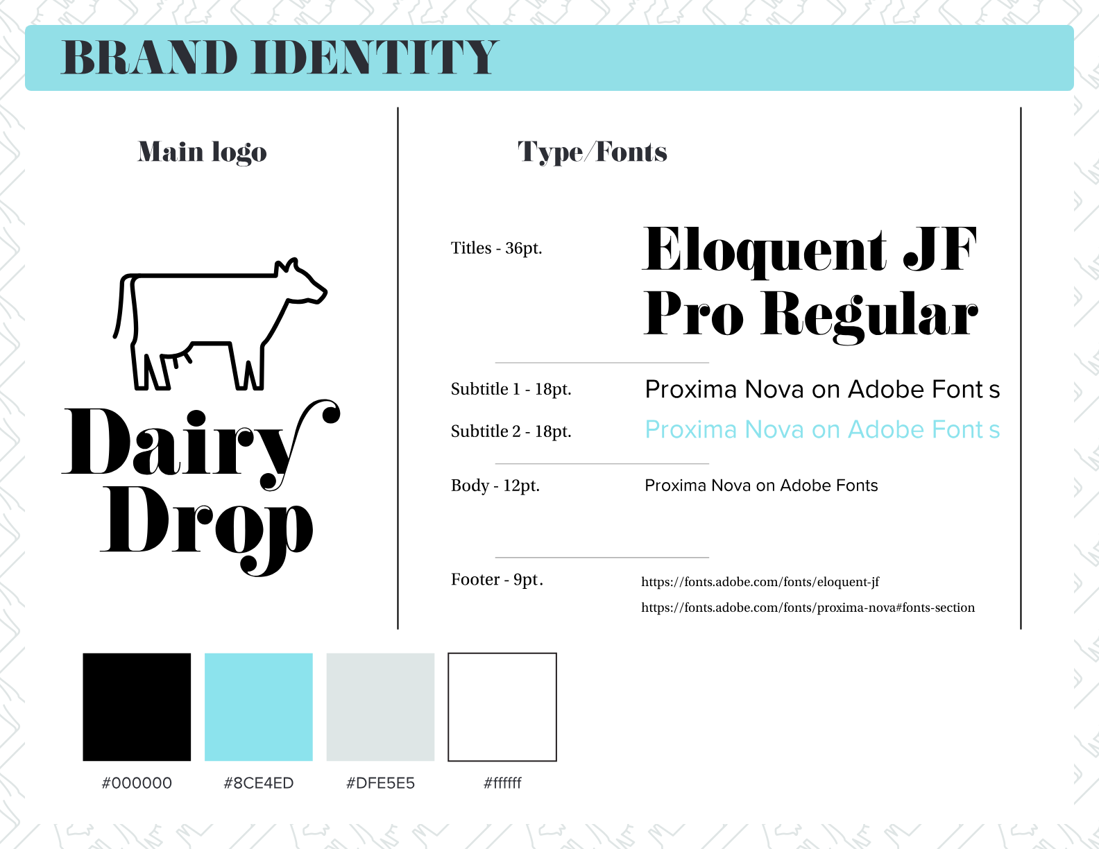
Colors and typography
A clean, dairy-fresh identity — a soft cyan carried by black and neutral surfaces. Confident serif display for headlines, humanist sans for the interface.
Research & competitive benchmarking
I benchmarked four direct competitors across ten feature dimensions, gathered qualitative signal from a walk-and-talk interview, and grounded delivery-abandonment and market-size assumptions in secondary data.
Personas & empathy maps
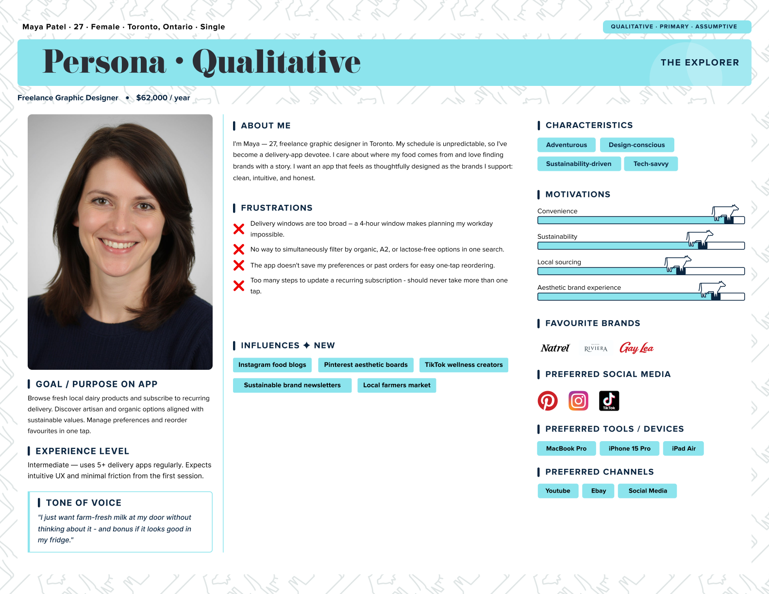
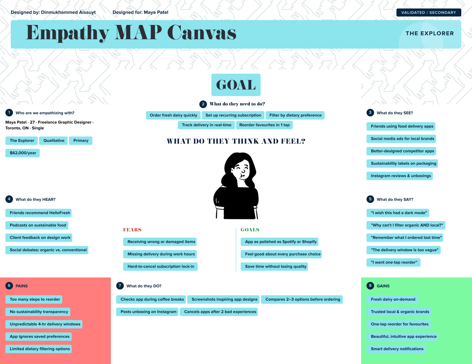
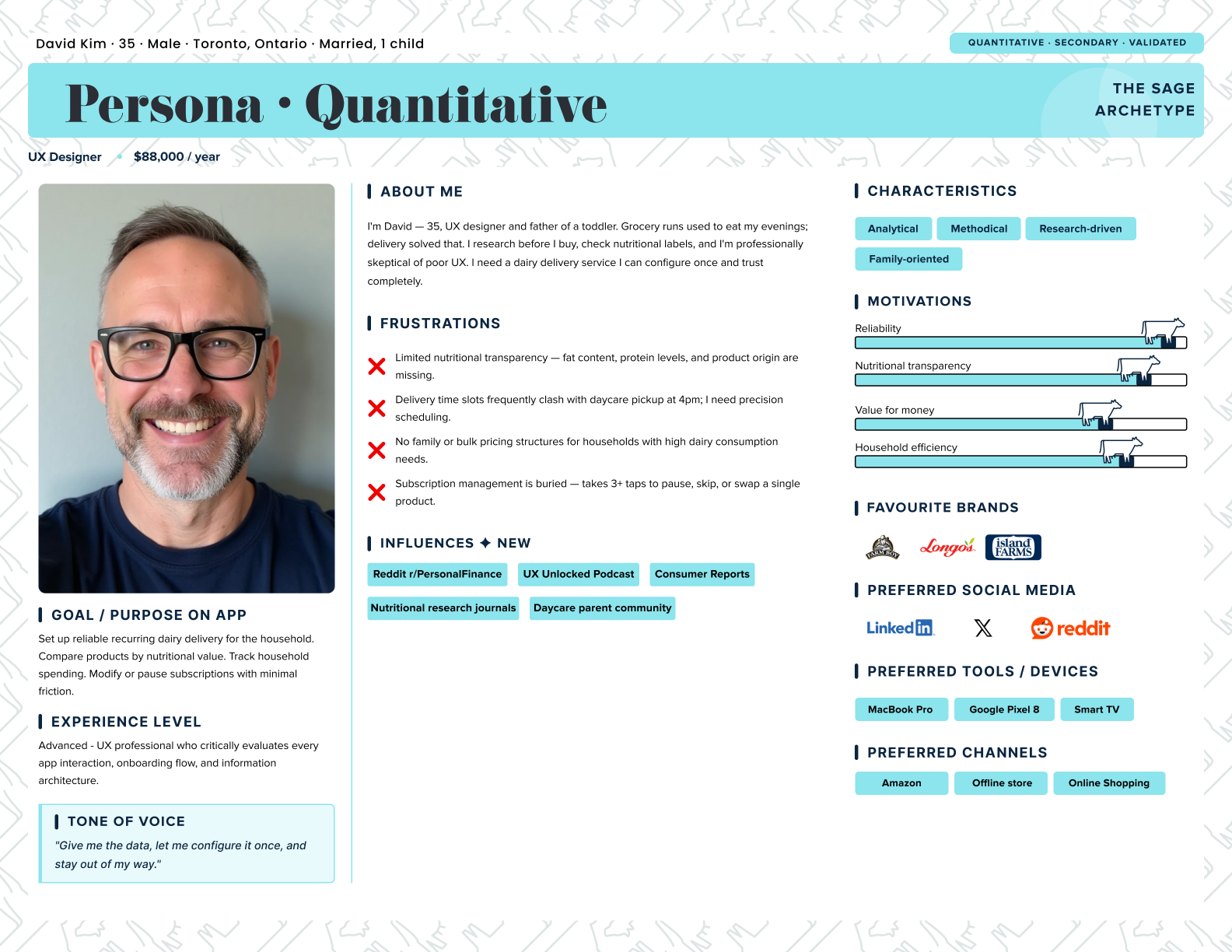
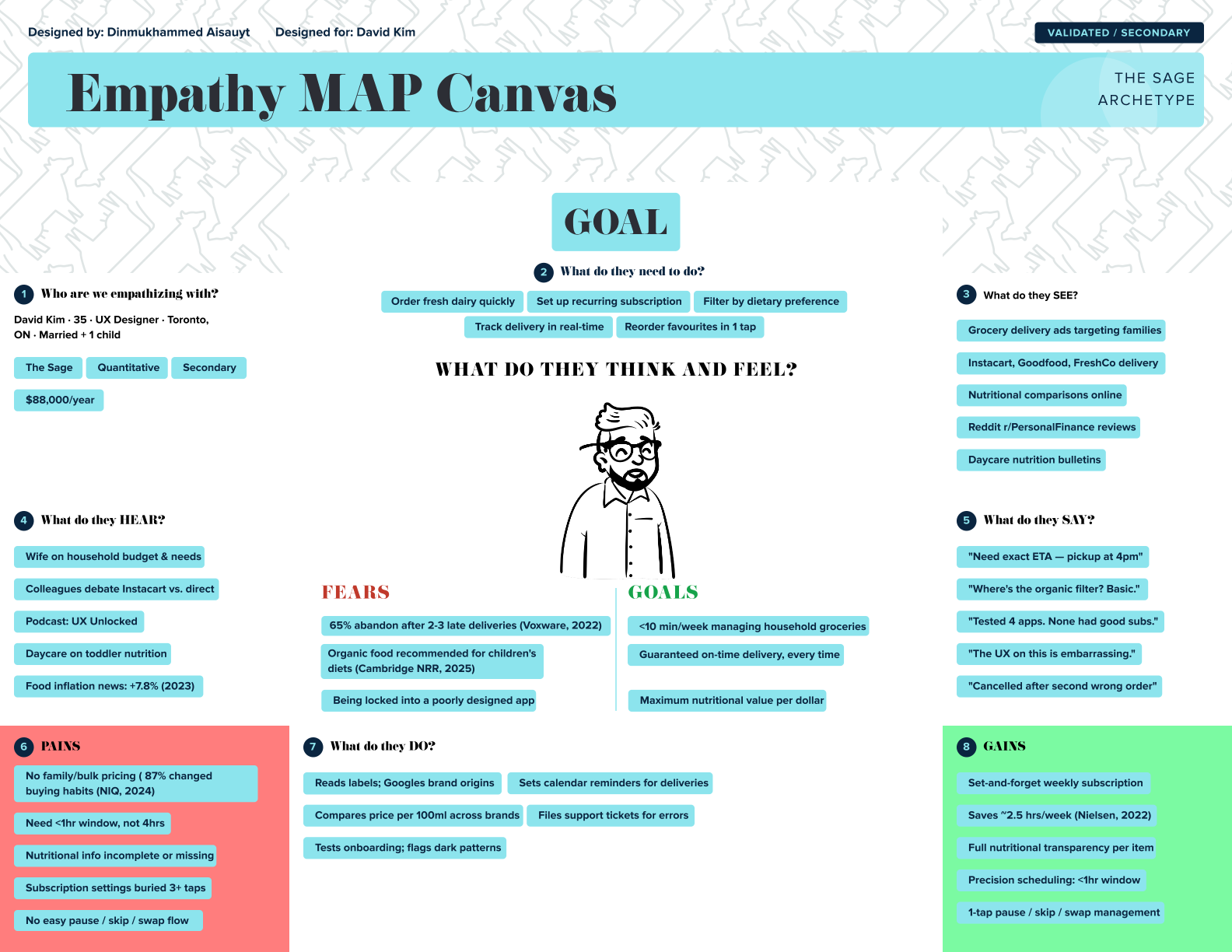
Two personas anchored the work: Maya, an assumptive qualitative “Explorer,” and David, a validated quantitative “Sage.” Empathy maps turned their frustrations, fears and gains into design fuel.
User flows, IA & journey
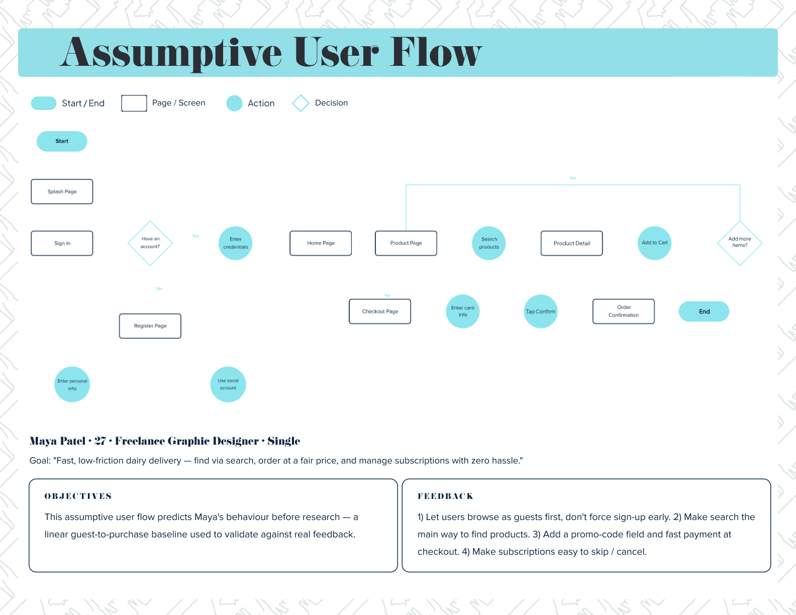
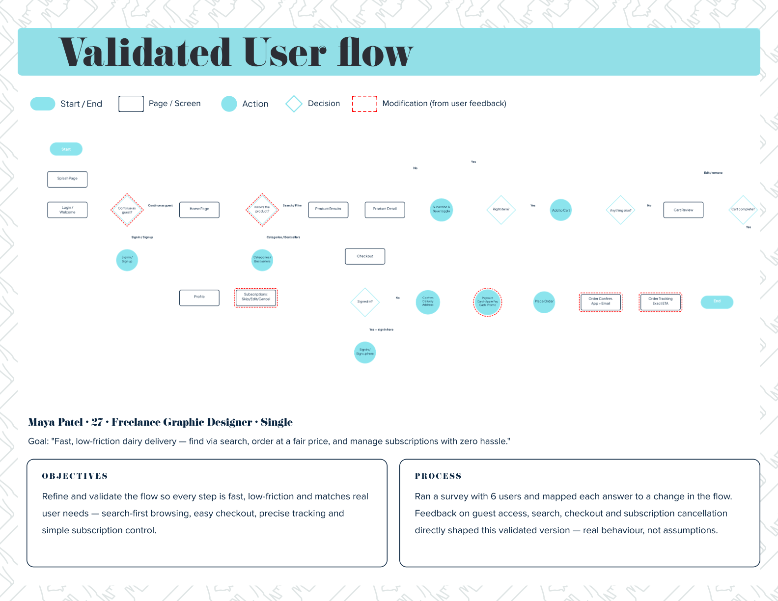
I mapped an assumptive flow first, then validated it against the user interview and secondary research and rebuilt it — guest browsing, search-first discovery, and one-tap subscription control shaped by those findings.
Mid-fidelity screens
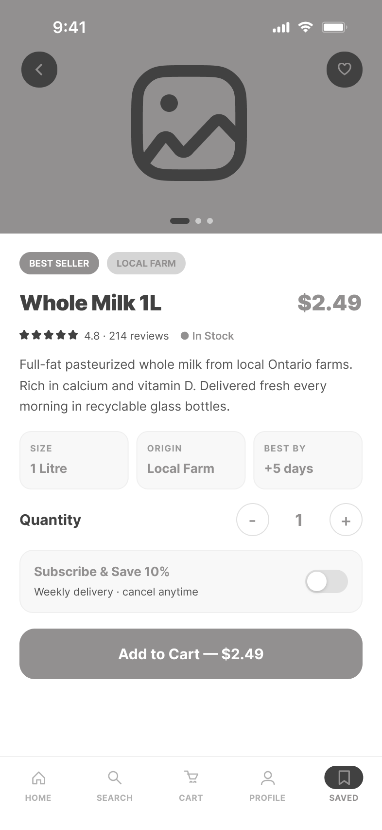
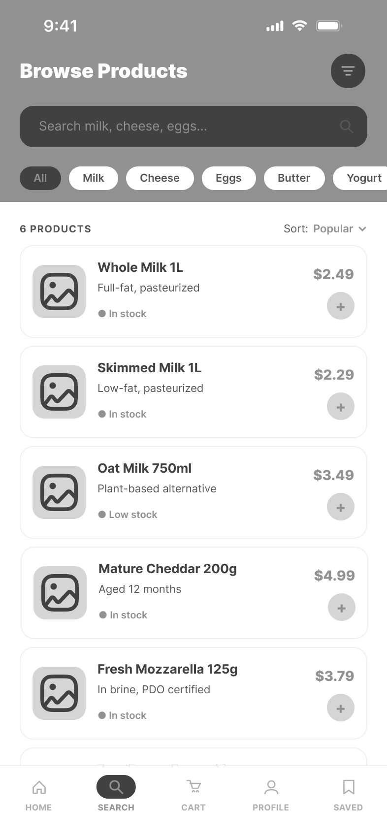
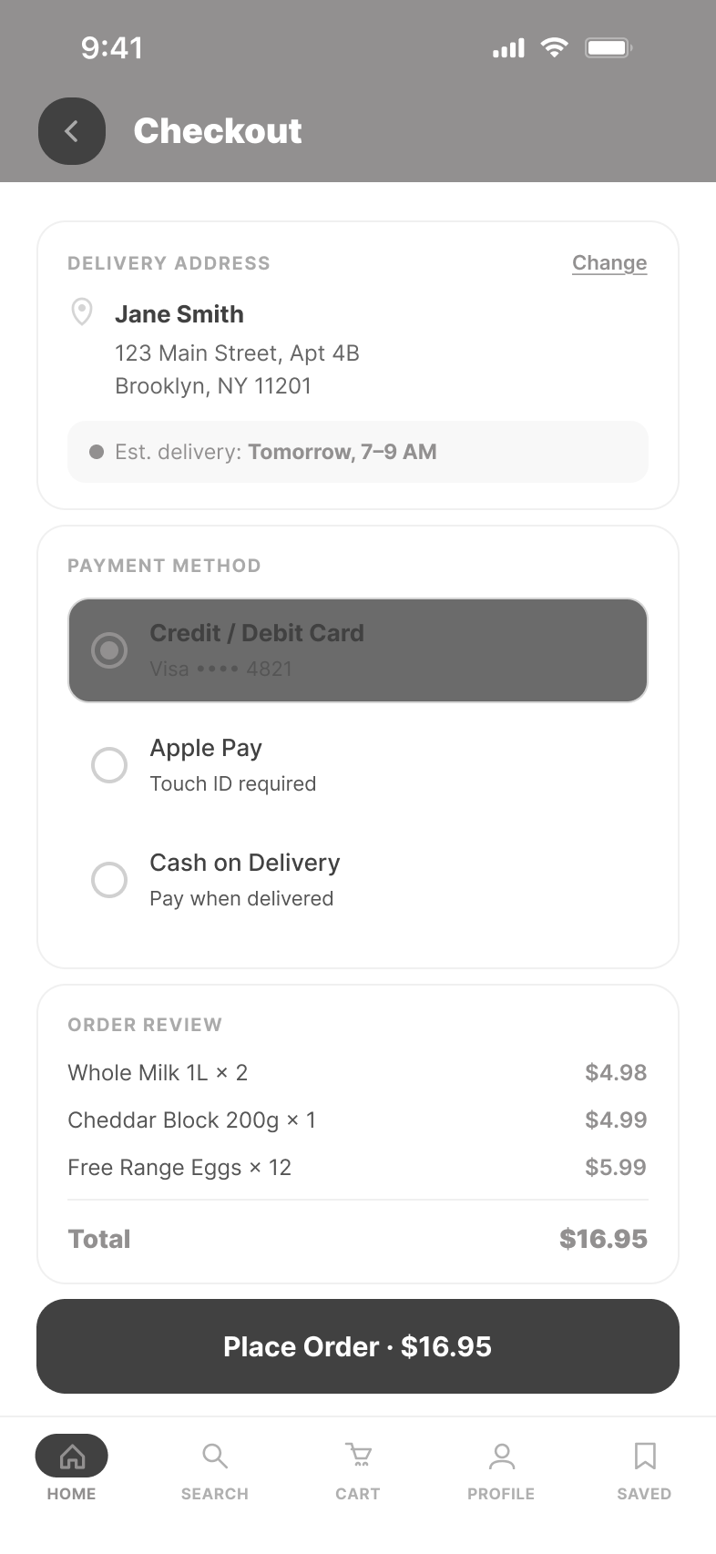
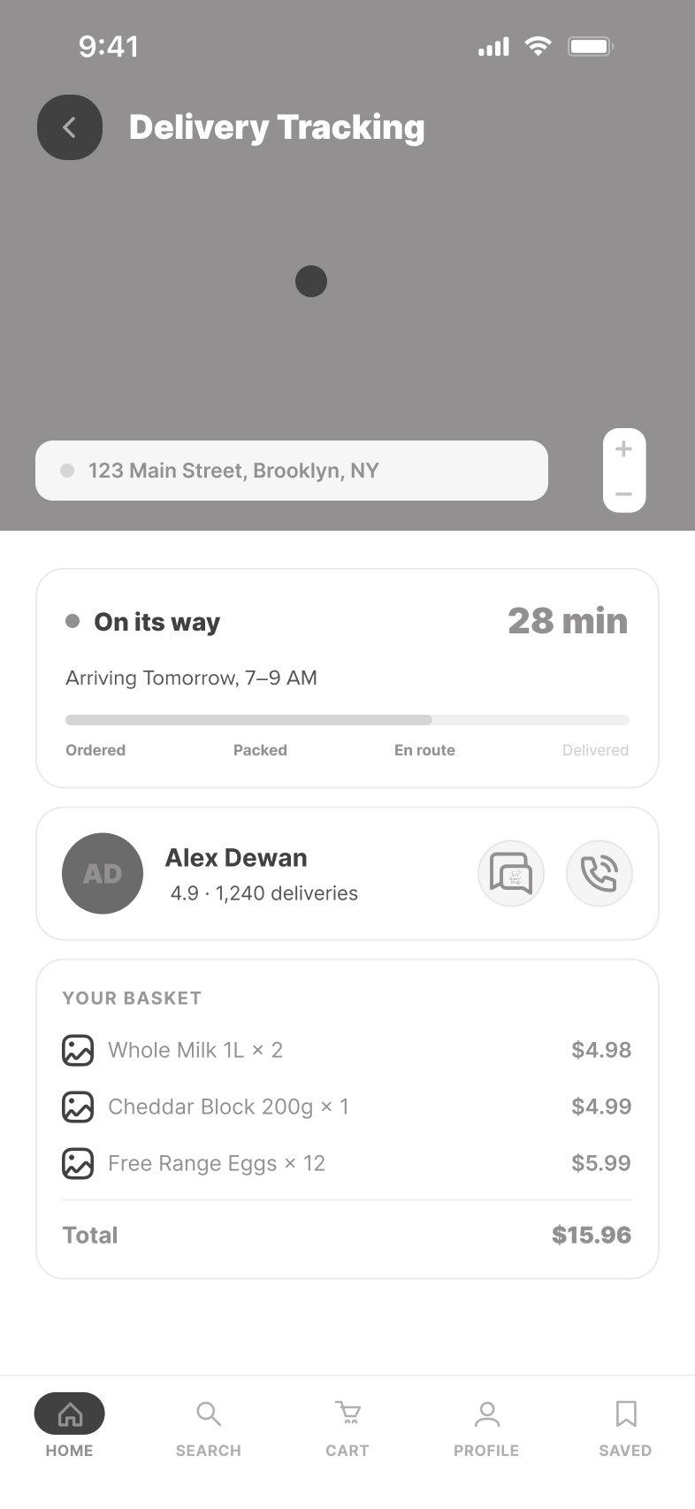
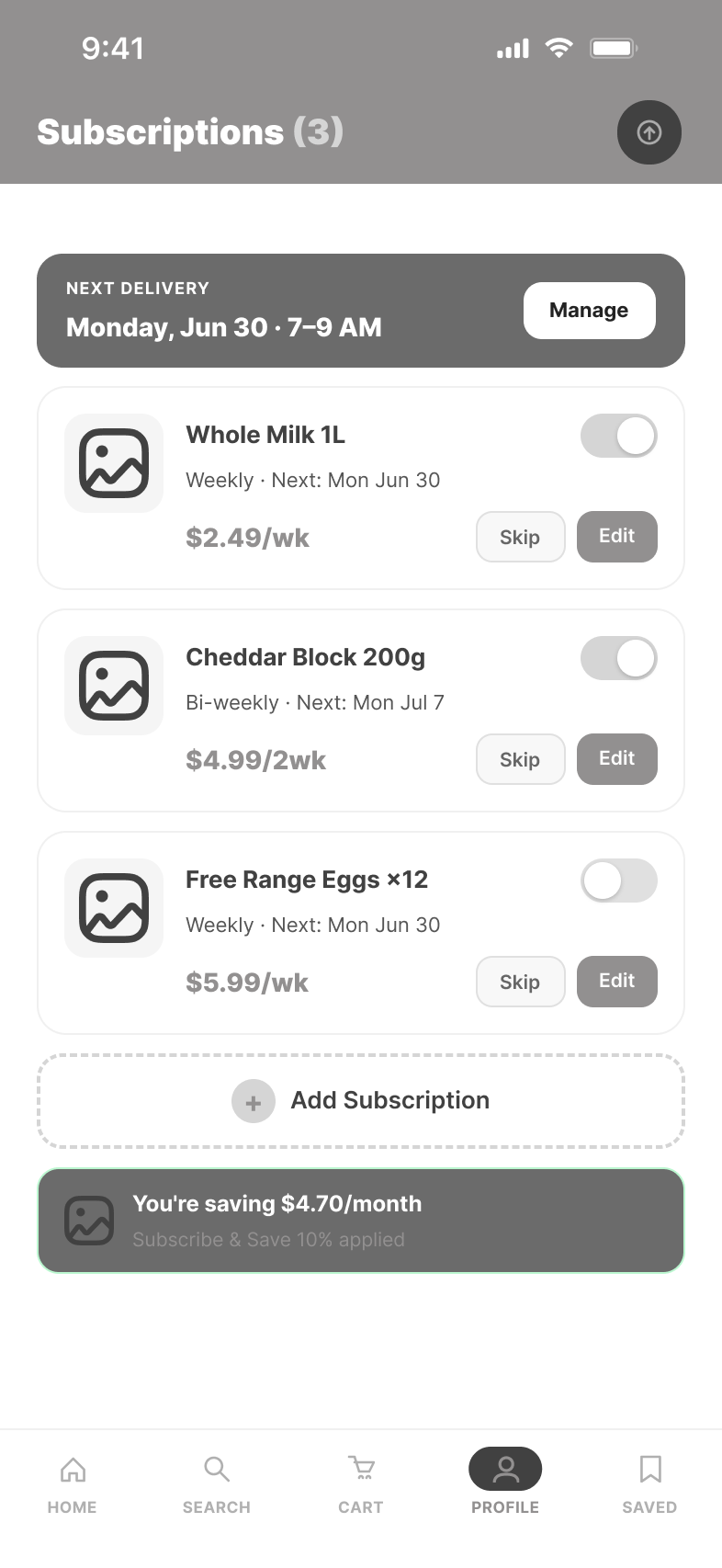
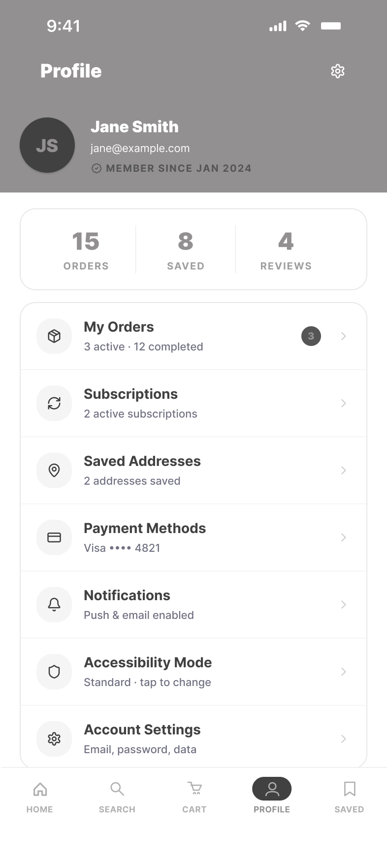
Grayscale mid-fidelity screens locked layout, hierarchy and flow before any visual styling — proving the structure works on its own, with no color or imagery doing the heavy lifting.
Hi-fidelity screens
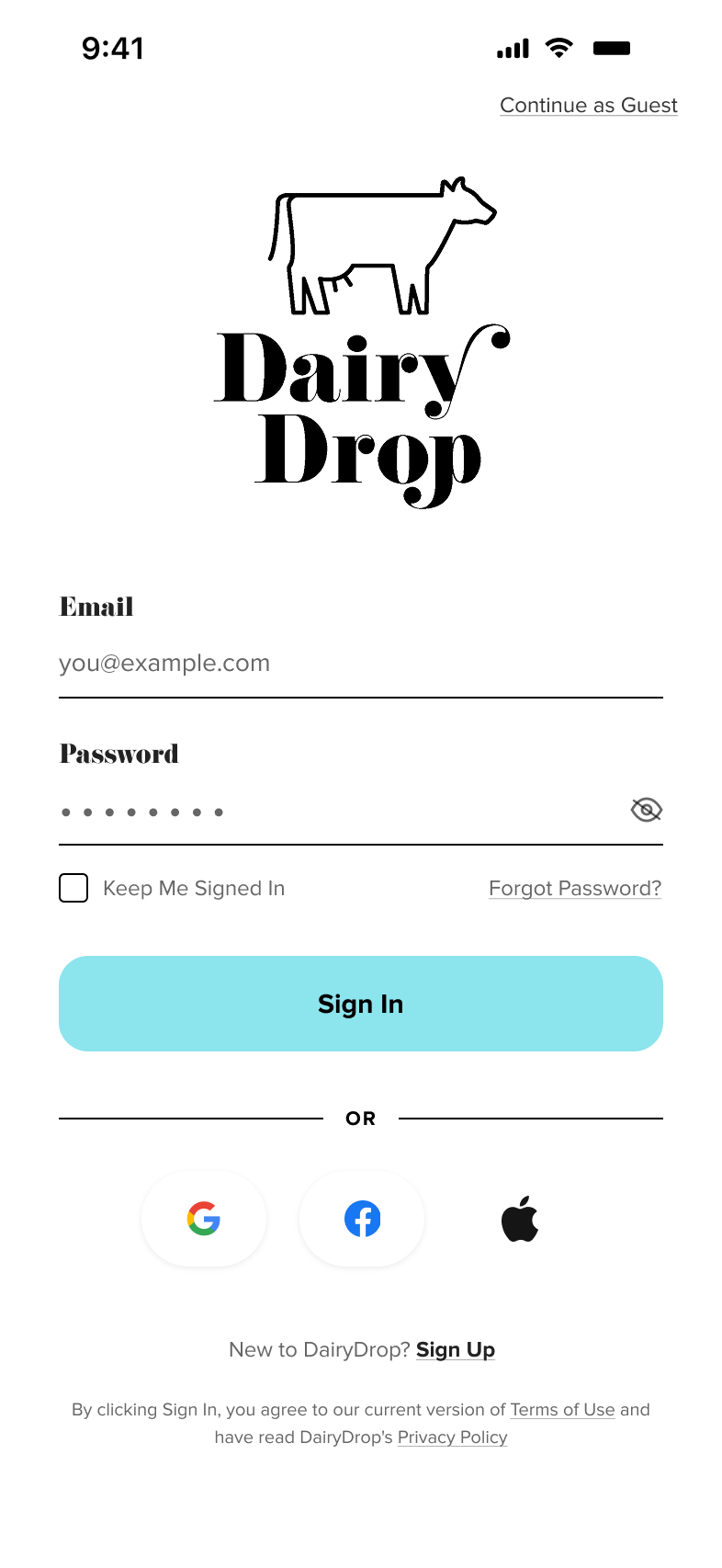
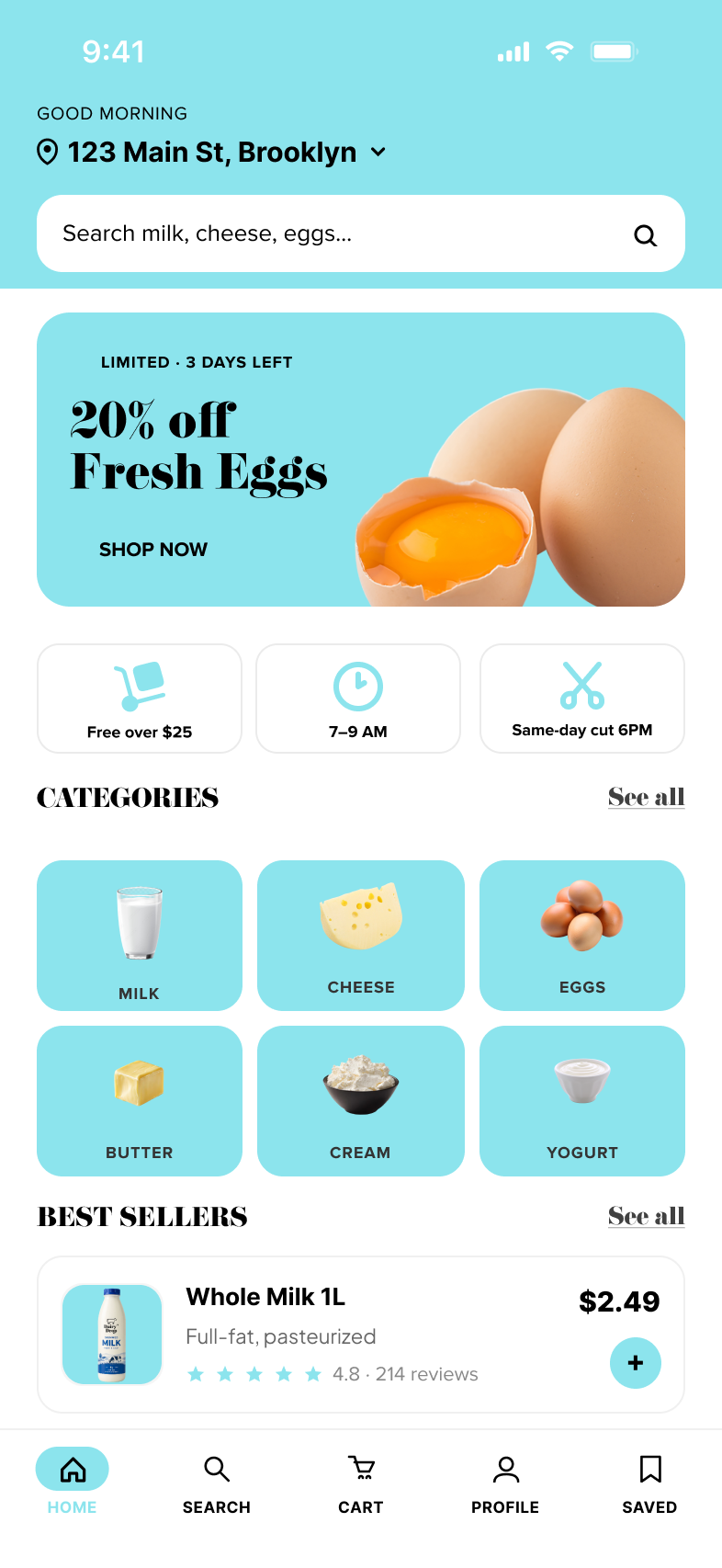
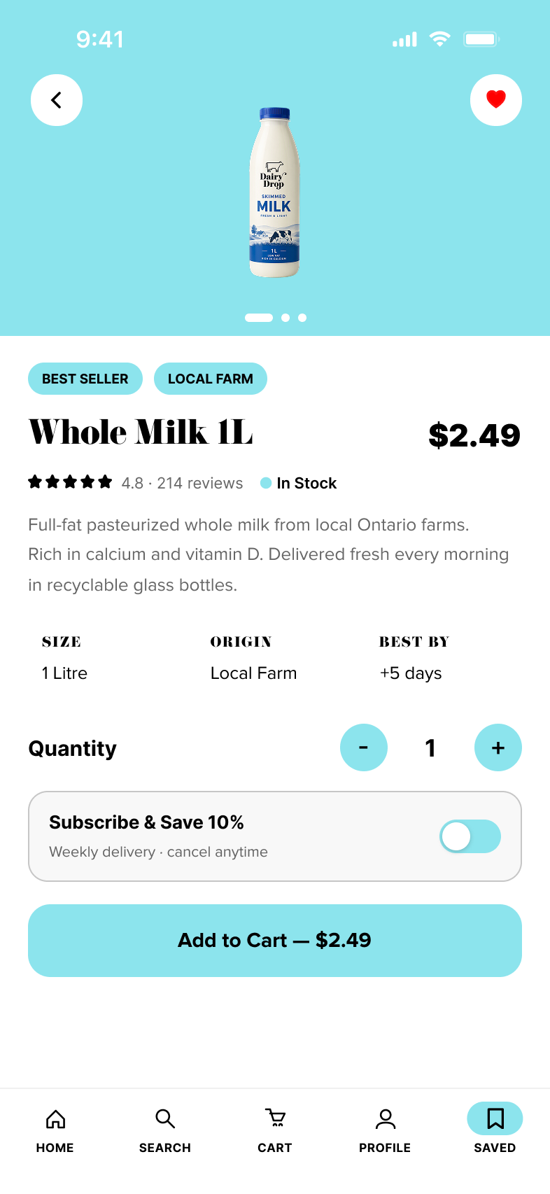
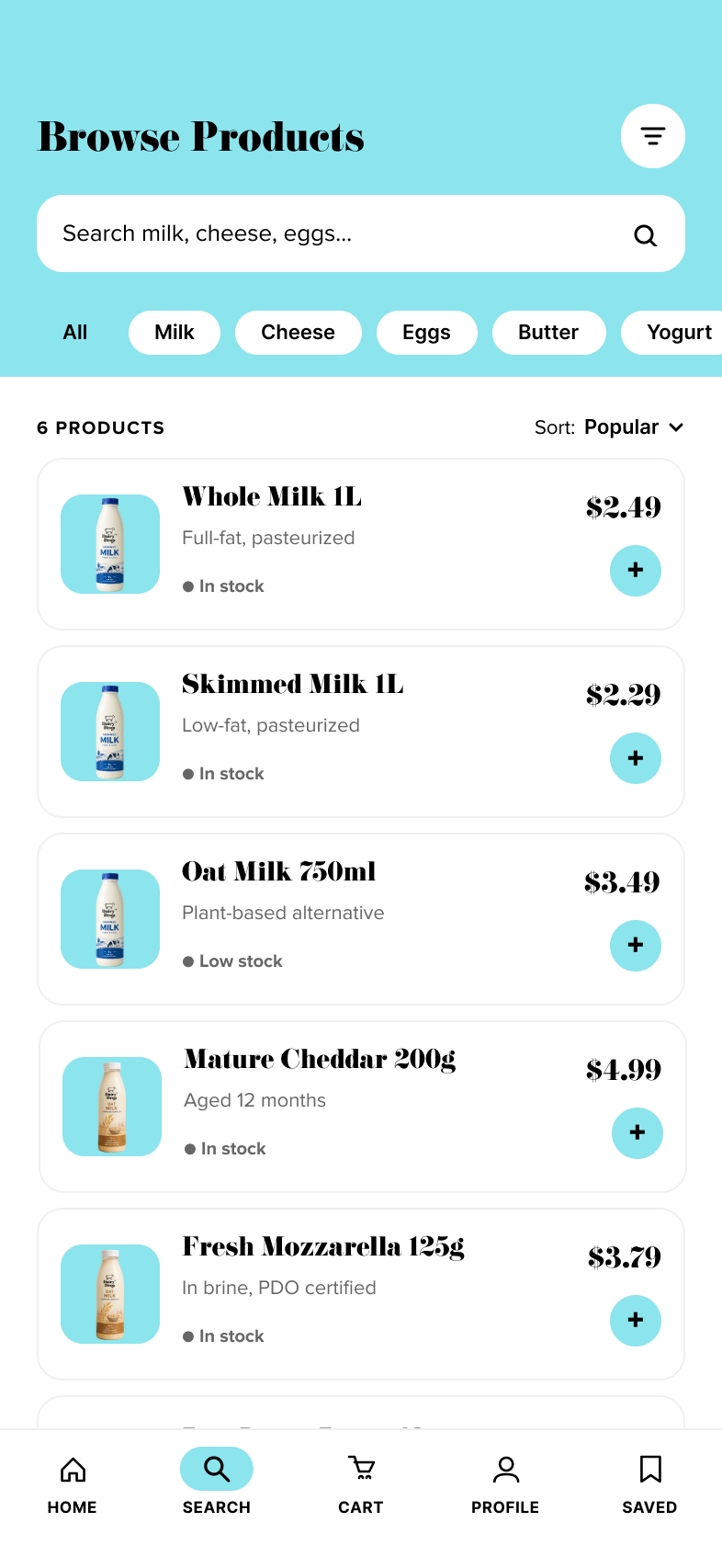
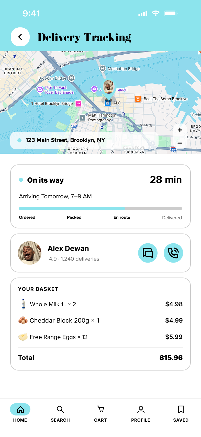
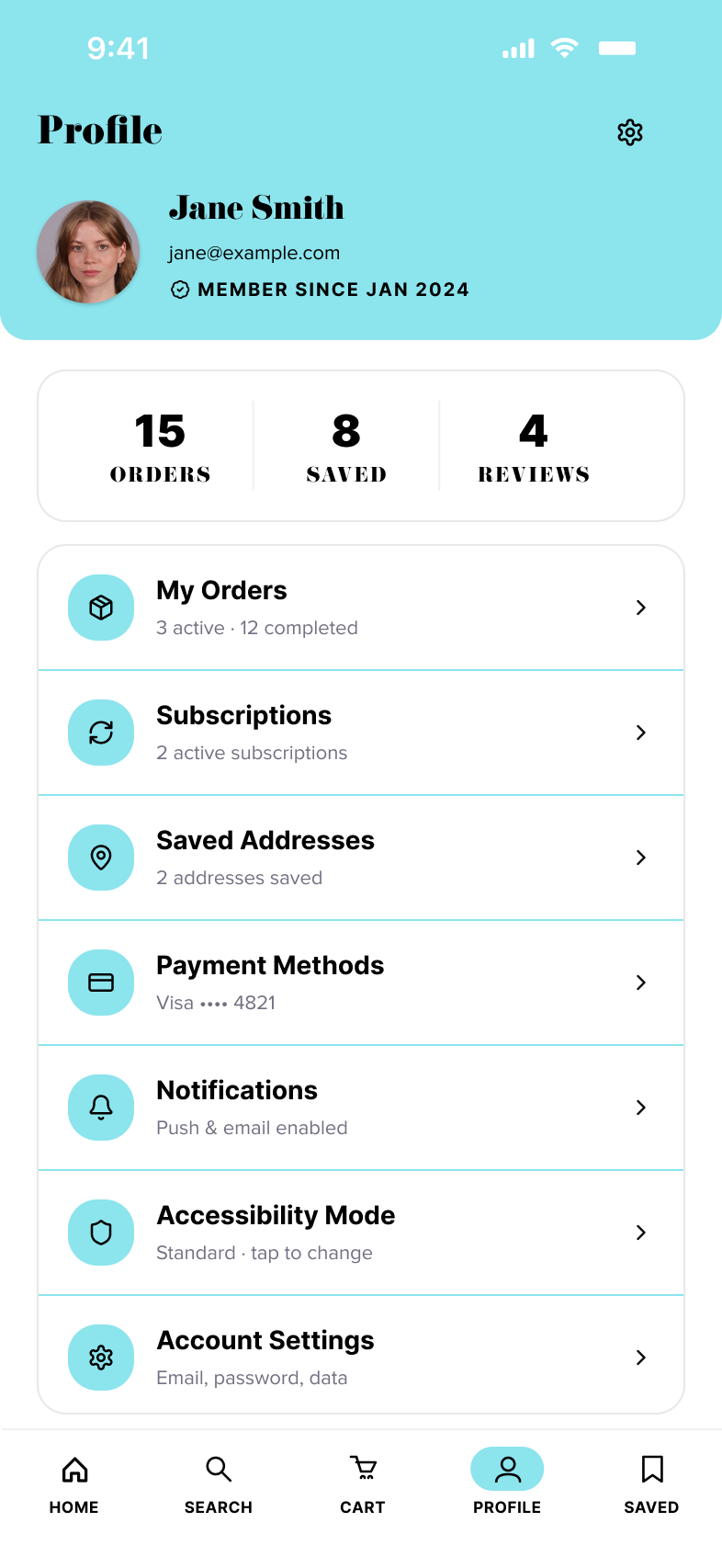
Eight screens define the complete experience — from guest-friendly sign-in and search-first home to product detail, checkout, real-time tracking, and one-tap subscription management.